Smith chart by projection
2024-02-16 math electronics
I want to use a Smith chart in an upcoming article here, but it occurs to me that most readers probably aren't familiar with them. Smith charts don't come up very often in audio, being mostly an RF thing. So as with complex numbers, I'm posting this separate article to introduce Smith charts, and then I can refer back to it when I use them later.
Smith charts are appealing because they look cool. However, they're also a bit scary and mysterious, because they're associated with the black magic of RF engineering. In my article on PCB design mistakes, I talked a bit about the electromagnetic considerations involved in designing a circuit board. At audio frequencies, we mostly expect wires to be wires and insulators to be insulators. We want a signal in one PCB trace to stay in that trace, not hop into a neighbouring trace by means of electromagnetic radiation; and the extent of "electromagnetic considerations" relevant to audio PCB design basically just comes down to making sure that leakage between traces isn't going to happen.
In radio frequency (RF) design, especially at microwave frequencies, everything gets weird. In a microwave circuit board like the one below (which is from a Ku band satellite downconverter, running at between 12 and 18 GHz), the wavelength is short enough that PCB traces can no longer be regarded as theoretical wires. Instead, every trace carrying a microwave signal is a transmission line with a characteristic impedance, and the designer needs to deal with matching the components to the transmission line at both ends.
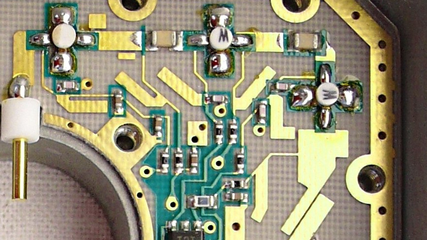
In the photo you can see some wide traces that seem to go off to nowhere. I think those are quarter-wave microstripline stubs being used as band-reject chokes on the narrow traces that feed power into the ICs. The chokes keep RF interference out of the power supply. Any RF propagating along the power trace will go sideways down the choke trace, bounce off the end, and then come back 180° out of phase, cancelling itself out on the power rail. Also visible toward the lower right of the photo is the upper end of what I think amounts to a bandpass filter made of several diagonal resonating microstriplines side by side; the desired signal will be coupled from one to the next while anything higher or lower just fails to cross between the disconnected pieces of copper. It's hard for me, as someone who usually works with audio where the rules are different, to understand how such technology works or how people manage to design it. Black magic, as I said.
It then seems more or less reasonable that black magic might be practiced using a magic circle.
Identifying the problem
As I said in the complex numbers article, a good first step in understanding any mysterious technological thing is to find out, and try to state as clearly as possible, what problem it solves.
With the Smith chart, the general problem being solved is the problem of visualizing complex numbers, especially complex impedances for the purposes of matching them. This is a context where it's necessary to think about both large and small values, including some that are theoretically zero or infinite.
In Eurorack modular synthesizers in particular, there's a fiction that the impedance of inputs is infinite and the impedance of outputs is zero. We want to only think about voltages, not currents, and we want the voltages not to "drop" as a result of power consumed by an input. For more information on this subject especially in relation to synthesizers, see my earlier article on equivalent circuits. It's usually expected that the open-circuit voltage of each output ought to be basically the same as the voltage under load, and the loads ought to be light enough for that to work. In real life, the Eurorack input impedance is probably more like 100kΩ than truly infinite, and the output impedance might be as high as 1kΩ (usually lower), and then because those are not infinity and zero, the voltage ends up being something like 99% of what someone thinks it "should" be and that is regarded as an annoying compromise.
When it's necessary to have really precise voltages; when the connection is meant to deliver power as well as information (such as the connection between an amplifier and speaker); or at radio frequencies, in those cases it no longer works well to have impedances so vaguely specified, with with input and output much different from each other and targets that are not physically achievable anyway. In many applications, people aim instead for the input and output impedance to be the same, and with RF, the target value is often quite low - frequently 50Ω in particular.
When you're connecting for instance a transmitter to an antenna, through a length of coaxial cable, the problem of making sure the transmitter and antenna match properly to each other becomes rather complicated, especially because the cable in between starts acting like a component itself, and all the components you have available to introduce into the circuit may be subject to freaky RF effects. The matching needs to be done using complex numbers because it's AC, and there can be a lot of things to keep track of.
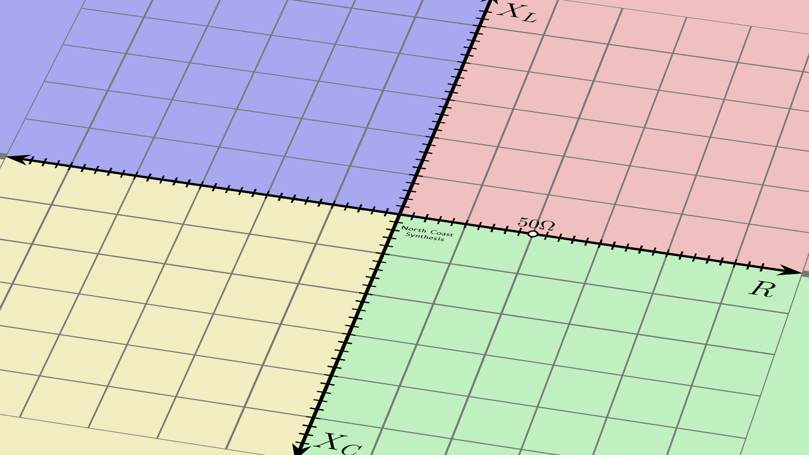
So, it's appealing to plot the impedance values on a chart of some kind, using the fact that complex numbers map naturally onto the geometric plane.
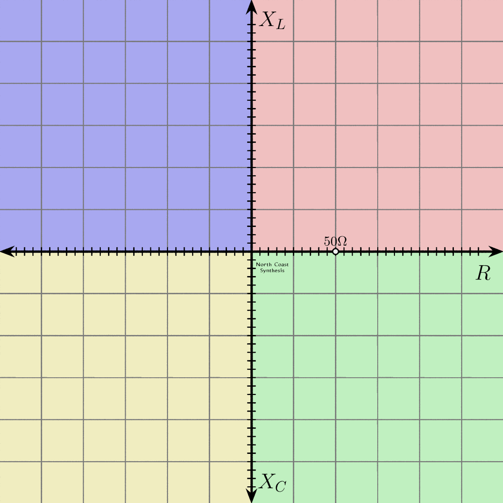
Plotting points in Cartesian coordinates as shown above doesn't work well if some of your numbers are much larger than others. You might easily have to deal with numbers like 1Ω and also numbers like 1kΩ in the same problem; a scale that shows one well will either put the other off the chart, or have it merge into zero. Using log-log graph paper might help, but that has problems with zero and negative numbers. There's also an obvious problem if you want to plot a point representing infinite impedance.
A side issue is that in many matching problems, it's possible to say that although the impedances may be large or small, and inductive or capacitive, at least we're sure the resistive component will not be negative. That means the entire left side of the grid shown above is wasted.
Now here's a more specific statement of at least one problem the Smith chart is meant to solve: the Smith chart is an answer to the question how can we fit both zero and infinity onto the page, and have it all work out nicely, when making a diagram of complex impedances that happen to have nonnegative resistive component?
Projection
One way to define the Smith chart involves replacing a complex number z with (z-1)/(z+1) and proving things symbolically about the result. That is perfectly correct, but it may not be easy to understand, especially if complex numbers are unfamiliar. I prefer to think of it in geometric and visual intuitive terms, as two stereographic projections with a rotation in the middle. The resulting derivation is quite straightforward and I'm probably not the first to think of it, but I haven't been able to find this approach documented elsewhere on the Web.
Let's take the Cartesian coordinate plane for complex impedance as shown above, and tilt the camera a bit to visualize it in 3D space.
Into this 3D space, imagine introducing a sphere. The sphere can be any convenient size, although in this case I've drawn it to have a diameter of 50Ω (bearing in mind ohms are the units of distance in this abstract space). The sphere should just touch the impedance plane at the origin, the Z=0 point. In the diagram, I have also marked with a little yellow dot the point opposite where the sphere touches the plane. You might say that the sphere's South pole is touching Z=0 and the yellow dot marks the North pole.
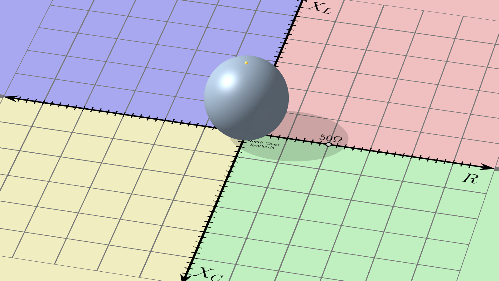
Now, from any point on the impedance plane, draw a line through space from the point to the sphere's North pole. That line will intersect the surface of the sphere at one other point than the pole. For every point on the plane we can do this to find a unique point on the sphere, and vice versa except for the North pole itself - which by convention is associated with infinity.
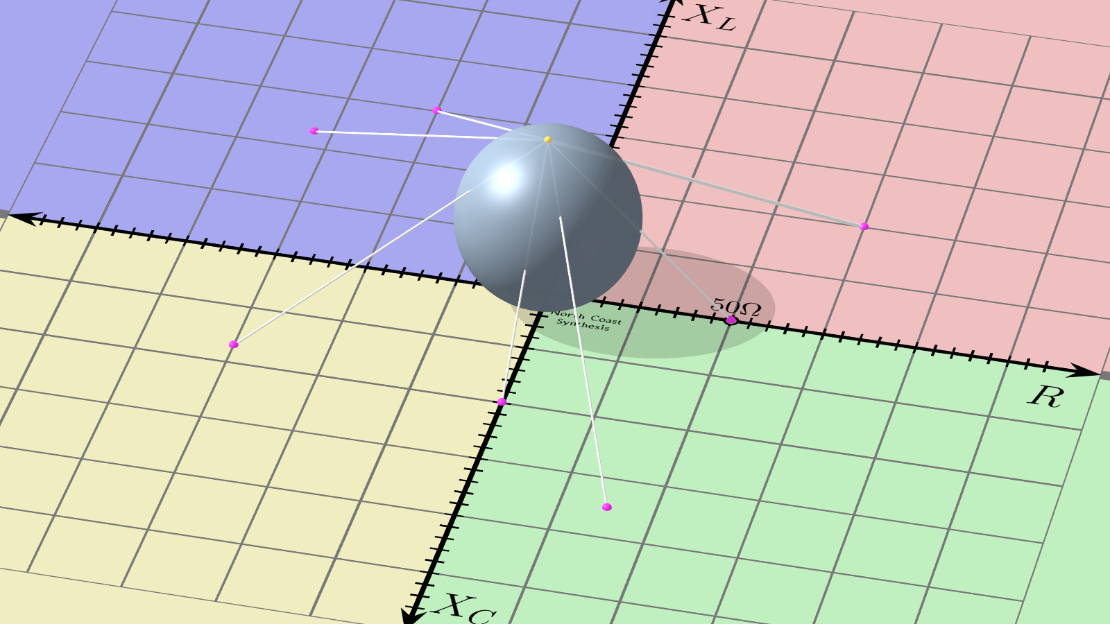
This operation is called stereographic projection and it is sometimes used in map-making in the reverse direction to warp the approximately spherical surface of the Earth to a representation on a flat two-dimensional map.
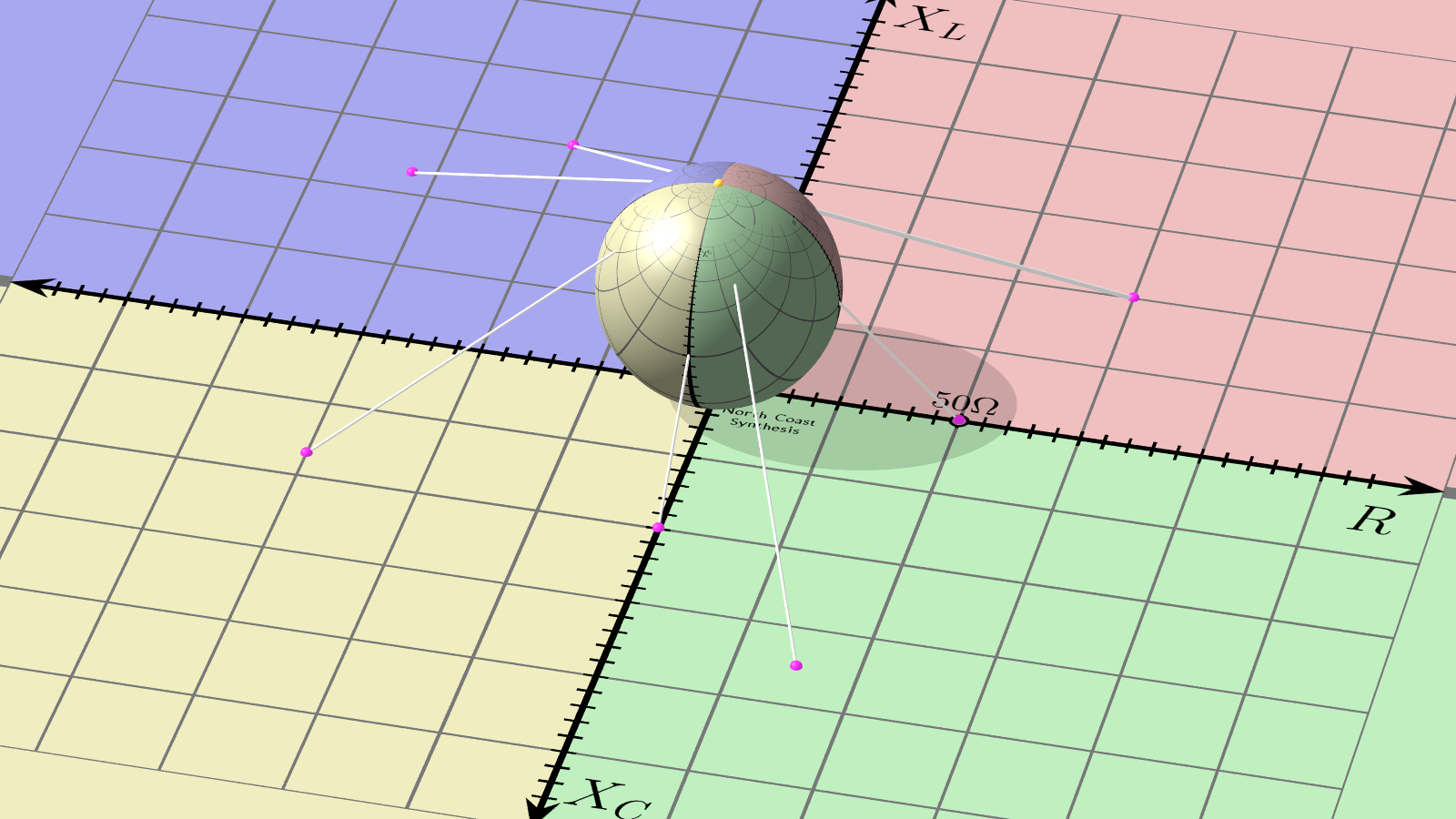
Here's another image showing the sphere coloured or painted with the grid pattern and other markings of the original impedance plane, using the stereographic projection to connect points on the sphere with points on the plane.
Now, here's a close-up of the same sphere, with the original impedance plane removed. One thing visible is that the entire impedance plane with positive and negative resistance and reactance from zero to infinity, fits onto the surface of the finite-sized sphere. So we have already achieved part of the goal by making the range from zero to infinity comfortably visible; but it's still rather inconvenient to have a spherical chart that won't fit on a flat page.
Notice on this sphere that the 50Ω resistance point is exactly at the rightmost extreme, just barely visible from this camera angle. I chose the diameter of the sphere to make that happen, but we could choose any other positive-resistance point for this role by making the sphere a different size.
Something else to notice follows from a basic property of the stereographic projection. Every straight line or circle on the original flat impedance plane has turned into a circle on the sphere. That relationship works in the other direction as well - circles drawn on the sphere will turn into straight lines or circles under a projection in the other direction - and that will become significant later.
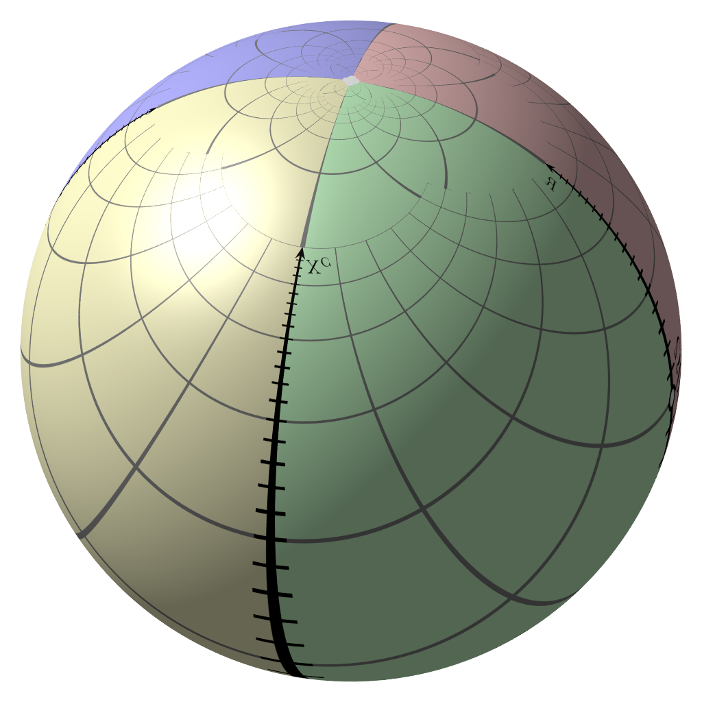
Now, here's the clever bit. Take this sphere and rotate it 90° so that the 50Ω resistance point ends up at the bottom. This rotation is around a line connecting the ±50Ω points on what was the reactance axis.
Now positive resistance corresponds to the Southern Hemisphere and negative resistance corresponds to the Northern Hemisphere.
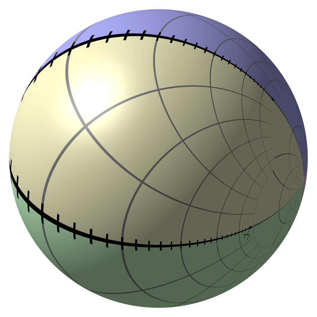
Take this sphere and put it back on the plane, just touching the plane at the 50Ω resistance point. And do the stereographic projection again to transfer everything from the sphere back to the plane.
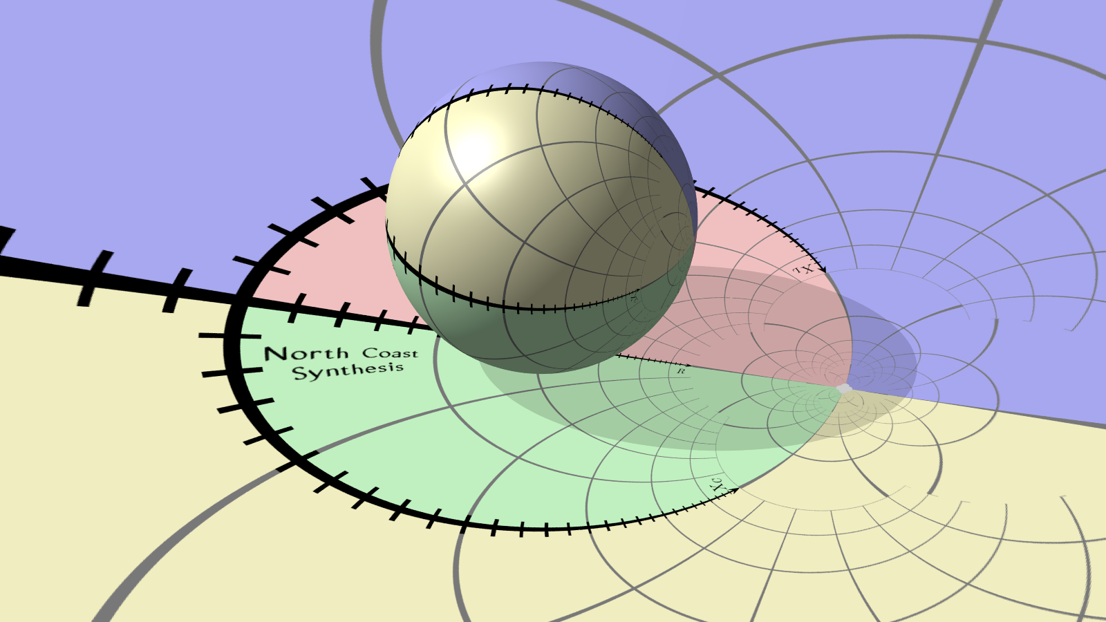
I think the above image would make a pretty good desktop wallpaper, so I've generated it in some higher-resolution versions you can download:
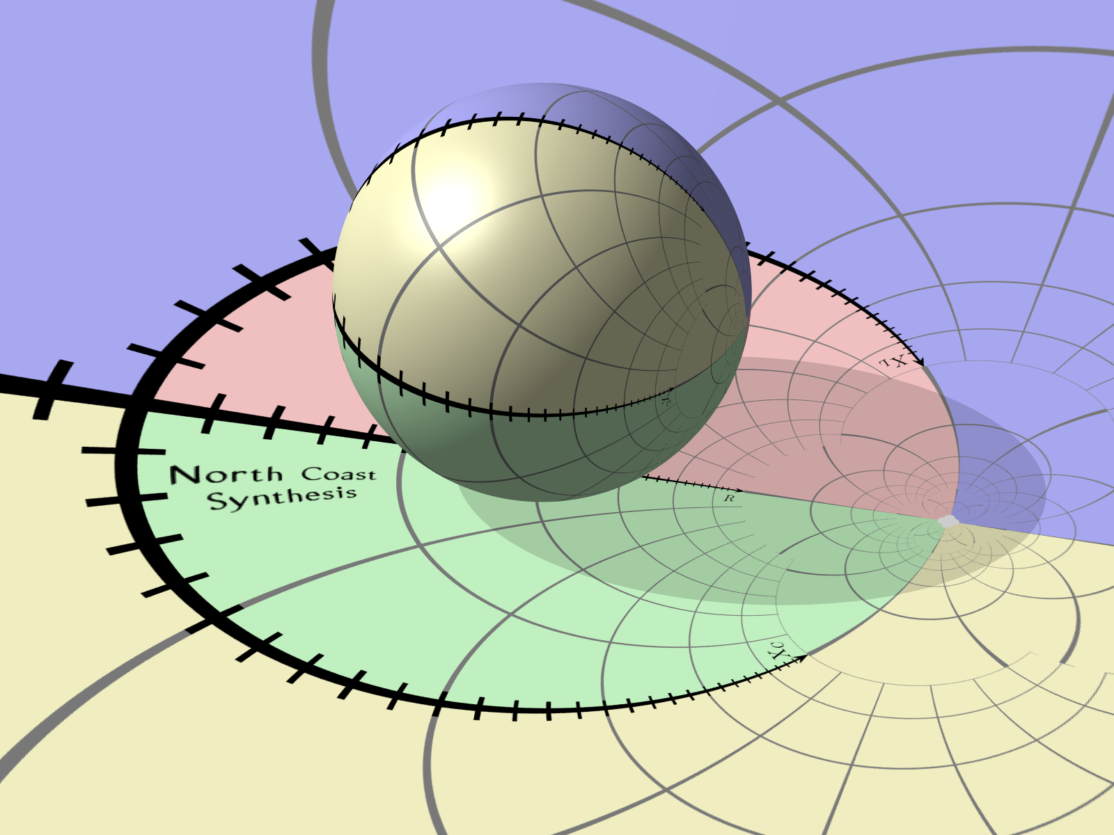
At this stage the positive-resistance section of the original complex impedance plane, which was half-infinite, has been transformed into a finite circle and its interior. Let's get the sphere out of the way and return to a two-dimensional view.
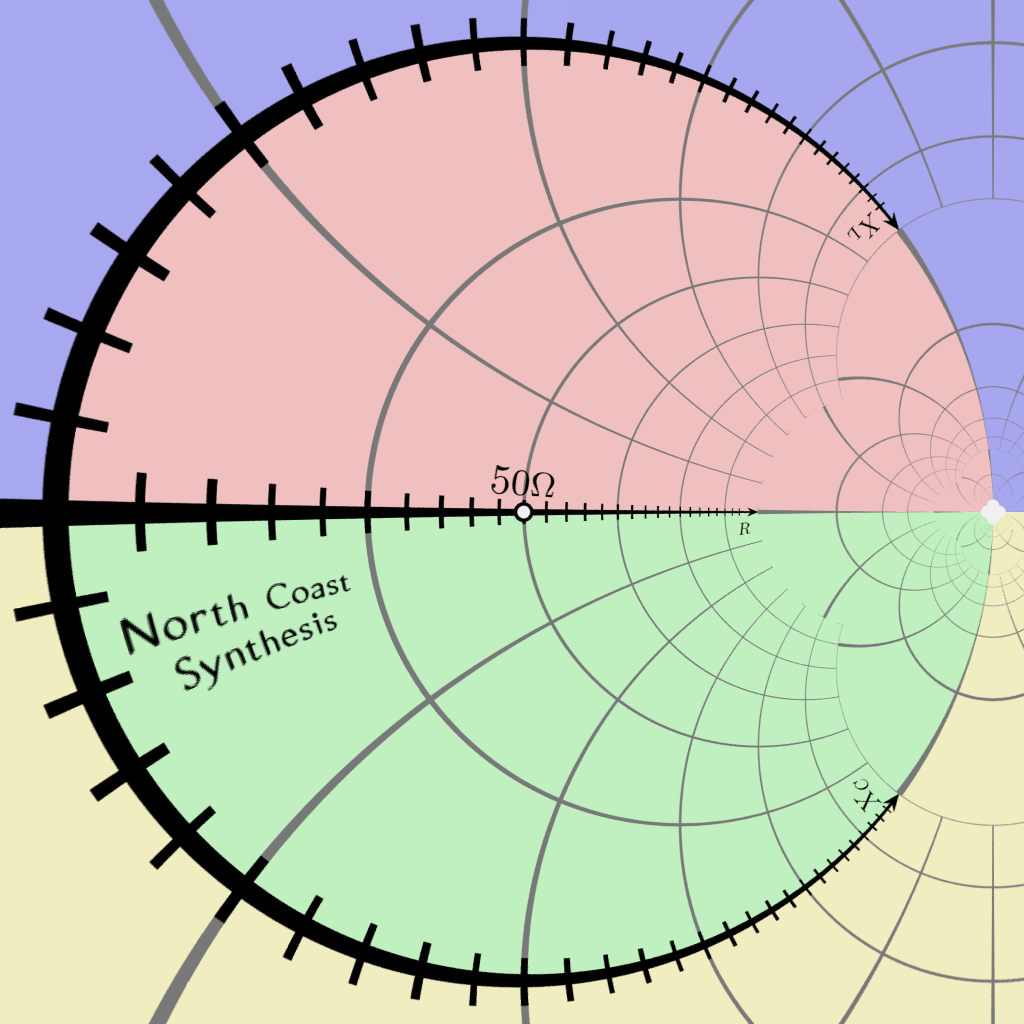
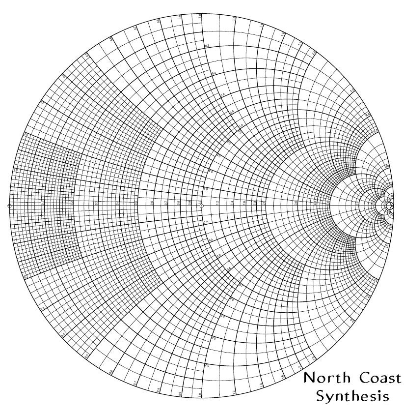
That's a Smith chart.
Note how the originally-existing horizontal resistance axis is still horizontal, but it has been rescaled so that zero is at the left, 50Ω is exactly in the middle, and infinite resistance is at the right. The positive (inductive) reactance axis, formerly going up from the origin, now goes clockwise around the circle toward infinity. The negative (capacitive) reactannce axis goes counterclockwise around the outer circle, again toward infinity. All the old grid lines (except the real axis, which remains straight) have turned into circles passing through the infinite-impedance point.
This view makes clear an issue which may be surprising, but is mathematically correct: that in this context there is only one infinity. Whether you get to it by way of inductive reactance, capacitive reactance, or pure resistance, an open circuit is the same as any other open circuit.
The warped coordinate system of the Smith chart makes it convenient to plot impedances, especially for solving RF design problems, because it captures both zero and infinity in the same view. As long as the resistance component is nonnegative, everything stays on or within the boundary circle corresponding to the reactance axis. So it's an appealing way to present any data that consists of complex numbers with nonnegative real component but potentially a large dynamic range. And that's how I plan to use it in my future article.
For RF design purposes, it turns out that the Smith chart transformation has other desirable properties too, largely flowing from the fact that stereographic projection preserves circles and lines, so not only the grid lines but also other circles and lines on the original impedance plane translate to circles and lines on the Smith chart.
The ordinary Cartesian coordinates measured on the Smith chart from the centre point (50Ω or other standardized impedance) end up corresponding to the "reflection coefficient," which is important in RF transmission-line problems. Important parameters like standing wave ratio and transmission line length can be calculated by just measuring distance from the centre, or angle around the centre or around some other point.
Because of the geometric significance of locations on Smith charts, these charts have historically been used not only for presenting data but also as analog computers of a sort, sometimes involving physical devices like rotating rulers and extra scales on the side. You could buy pads of Smith chart graph paper featuring the special multi-circular grid lines and printed to precise scale, for working out your own impedance matching problems. That kind of computational usage is much less common now that digital computers are readily available; now the chart is mostly just used for presenting information measured or calculated in some other way.
History and cultural issues
The (z-1)/(z+1) transformation seems to have been proposed at least three times independently in the 1930s, by Tousaku Mizuhashi in 1937; Amiel Volpert in 1939; and Philip H. Smith, also in 1939. So it's debatable whether it's really right to call it a "Smith chart"; but that is what's normally done, at least in English-speaking places.

In fairness to Smith, what he developed was more than just the (z-1)/(z+1) transformation. He also originated a layout of circular scales around the main chart, linear scales arranged at the bottom (originally, on a rotating ruler, turning the whole thing into a kind of circular slide rule), and calculation techniques associated with these elements.
When preparing this article, I thought it would be fun to include some downloadable PDFs of blank Smith chart forms, and I had a look online. What I found was interesting, and I think it reveals a cultural insight into the role of these charts.
There are many downloadable Smith chart forms available on the Web, and most of them are pretty bad. In particular, many downloadable Smith chart forms are pretty clearly bitmapped scans, of varying quality, of the blank forms that Smith's own company used to sell. Every time, the people doing the scans have added their own branding to the image. There are also some files out there that have been redrawn (Wikipedia includes an SVG version like this). One popular version seems to have been redrawn by "Black Magic Design" - and then heavily copied by a bunch of other people, some of whom added their own branding too or did things like changing the overall file format.
The redrawn versions I've looked at frequently contain errors, especially in the "RADIALLY SCALED PARAMETERS" section at the bottom of the form. Errors I've seen include:
- Center point labelled "1" on the "dBS" scale (should be 0).
- Center point labelled "0" on the "S.W. PEAK (CONST. P)" scale (should be 1).
- Unlabelled tick on the "S.W. LOSS COEFF" scale between 20 and infinity; a reasonable case can be made that this might be read as 30, 40, 50, or 100, and so it is useless for actually determining the value at that point.
- Spelling errors, such as "ORIGEN" for "ORIGIN" and "SWL" for "SWR" (common abbreviation of "standing wave ratio").
- Japanese yen sign ¥ substituted for infinity sign ∞.
- Horizontal lines missing, scales consisting only of ticks.
Further pieces of the puzzle are that very few people today seem to actually know what the extra scales at the bottom and around the outside mean or how to use them. Some are rather strange-looking; for instance, the ticks for the "ANGLE OF TRANSMISSION COEFFICIENT IN DEGREES" scale around the outside of the circle are themselves at funny angles, not pointing toward the centre of the chart like all the other azimuthal scales. (It turns out, though this is not obvious, that these ticks are meant to describe angles measured around the Z=0 point at the left of the chart, and so they all align with that point instead of the centre. In actual use you would lay a ruler over the chart and line it up between Z=0 and the relvant angle ticks.) It's also unclear just to what labels like "TOWARD LOAD →" refer.
If you try to find out what the extra scales mean and how to use them, it's not easy. Some of my Web searches only turned up Web-forum discussions in which someone would ask about the radial-parameter scales, be abused by other forum participants for being so stupid as to not already know, and never actually get an answer. Even to the extent that it's possible to find out, some of the extra scales have functions that don't seem very useful in the present-day context. For instance, "ATTEN. [dB]" seems to display nothing but twice the value of the "RTN. LOSS [dB]" scale - so why does it need to be a scale of its own? Anyone sophisticated enough to be using one of these forms can double the number in their head.
Nonetheless, in every redrawn version of the Smith chart, the "RADIALLY SCALED PARAMETERS" scales are reproduced, even down to non-functional details of graphic design like the way the labels attach to the scales along slanted leader lines. And except for occasional typos, the spelling and phrasing of the abbreviations for the scale names is carefully preserved in copies.
What I get from these indications is that:
- People using Smith charts today either don't understand the extra scales, or perhaps know about them but don't care. They do not actually use the extra scales in practice, during physical interaction with a hardcopy chart. As a result, they don't notice errors in the parts they don't use.
- The people redrawing Smith chart forms today, similarly, either don't know or don't care about the usability of the extra scales.
- Nonetheless, both kinds of people agree that the extra scales are important. They think it's just not a proper Smith chart without a section labelled "RADIALLY SCALED PARAMETERS" (in those exact all-caps words) at the bottom containing scales with certain very specific labels. They want that section to exist even though nobody will use or look at it closely.
- The consensus design of a newly-redrawn blank Smith chart form is now more a matter of tradition than of utility.
The blank chart form has gone through multiple generations of copying without anybody removing the scales that are unlikely to ever be used anymore, nor correcting or improving the design of still-relevant scales to make them more usable. Efforts are made to exactly reproduce superficial features like the inconsistent traditional punctuation of the abbreviations, and the uneven selection of which scale ticks get numbers; but when a copyist makes a mistake, it doesn't get corrected because the copyists and eventual readers aren't paying attention to the meaning, only the form.
I also had a look at the PGFplots Smith chart module, software for drawing Smith charts in the context of a graphics package I already use for other things. I wasn't too pleased with it. The grid it generates, when on the finest setting, is kind of ugly and hard to read, not using the well-organized fine-tick spacing of the traditional Smith chart and not easily configurable to do so. It doesn't use the traditional pattern of on-chart labels for the ticks, and again, it cannot be easily configured to do so.
Most interesting of all from a cultural perspective is that there's an option in the PGFplots package for plotting an "admittance" Smith chart, basically the mirror image of the impedance Smith chart, but there's also a snotty note in the manual explaining that this option produces incorrect results because the previous maintainer of the package "failed to understand how to render them completely," and so the option is being retained for backward compatibility but you shouldn't actually use it. I was quite startled to read that because it's not the tone I expect in this community. The overall pattern is the same I saw in the downloadable blank forms: we're going to do things the way they have been done in the past, and we think it's important to do things the way they were done in the past, but at least some of us don't understand the reasons why these things were formerly done, and we will implement features that we consider to be important to include but that we don't understand and will not actually use, beyond satisfying ourselves that those features superficially look right.
This all looks to me like a cargo cult, and if humanities research hadn't been destroyed by postmodernism in the last few decades, somebody could probably write an interesting Master's thesis about it.
Anyway, I joined the fun by creating my own redrawn version of the blank Smith chart form, and you can download it in PDF form here:
Each of those files contains multiple versions on different pages. The idea is that you can print out whichever page corresponds to the version you want. In each file I've got the complete form with the circular grid, scales in rings around the outside, and radial-parameter rulers at the bottom; a version with just the circular chart and the outer rings, no radial parameters; and a version with just the circular chart by itself and no extra scales at all. Then those three versions are repeated in black and in light-blue, which will turn to grey if printed on a black and white printer.
Bearing in mind that at this point I see printed Smith chart forms as more of an artistic tradition than a utilitarian tool, I've treated it as a living tradition - meaning I'm allowed to add my own creative input. I've corrected all the errors in the traditional design that I'm aware of. I've expanded out the abbreviations and reworded some labels so that there's some hope of people actually being able to read and understand what the labels refer to. I've marked the Z=0 point, much as the Z=1 point is traditionally marked but with a different symbol; and I've changed labels referring to "origin" and "center" to refer to Z=0 and Z=1 in a way that I think will increase the chance of people actually figuring out where to put the ruler. I've omitted a few traditional labels on things I think are sufficiently obvious that serious users don't need to be reminded about them. Overall, I think this is the most usable and correct version of a blank impedance Smith chart form I can create in 2024. So, I put my own branding on it, and I hope people will use and propagate it.
◀ PREV Why you need complex numbers || Outrunning the Noise Bear NEXT ▶